# Components
In order to better enjoy the convenience of this plugin, the plugin provides some out-of-the-box components.
# <SimplePagination>
- Source Code: SimplePagination.vue
- Usage:
<template>
  <SimplePagination />
</template>

<script>
import { SimplePagination } from '@vuepress/plugin-blog/lib/client/components'
export default {
  components: {
    SimplePagination
  }
}
</script>
- Output:

TIP
You can use $accentColor in palette.styl to adjust the
default colors of this component.
# <Pagination>
- Source Code: Pagination.vue
- Usage:
<template>
  <Pagination />
</template>

<script>
import { Pagination } from '@vuepress/plugin-blog/lib/client/components'
export default {
  components: {
    Pagination
  }
}
</script>
- Output:

TIP
You can use $accentColor in palette.styl to adjust the
default colors of this component.
# <Comment>
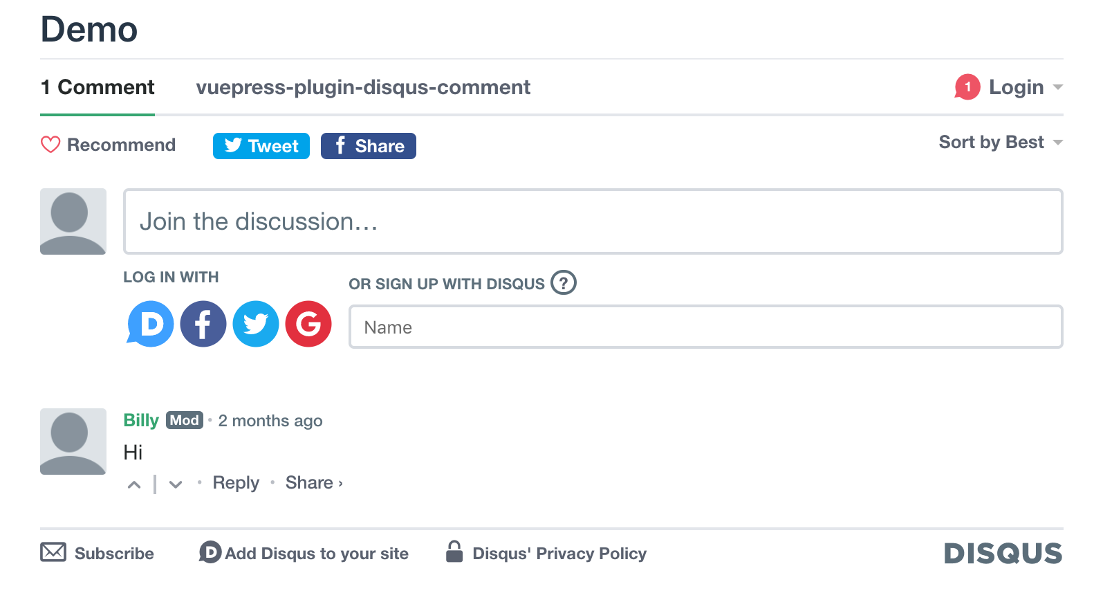
This component will automatically render the layout of comment service you pick. And if comment is not enabled, it'll render nothing.
Source Code: Comment.vue
Usage:
<template>
  <Comment />
</template>

<script>
import { Comment } from '@vuepress/plugin-blog/lib/client/components'
export default {
  components: {
    Comment
  }
}
</script>
- Output:
Disqus:

Vssue:

# <SimpleNewsletter>
Implemented by vuepress-plugin-mailchimp
Source Code: SimpleNewsletter.vue
Usage:
<template>
  <SimpleNewsletter/>
</template>
- Output:
